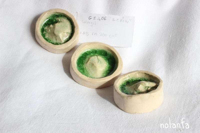
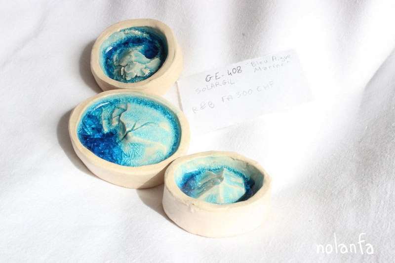
Glazes - 1
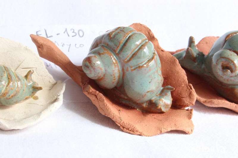
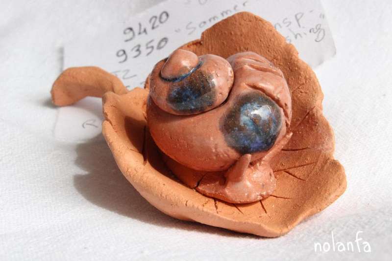
Snails
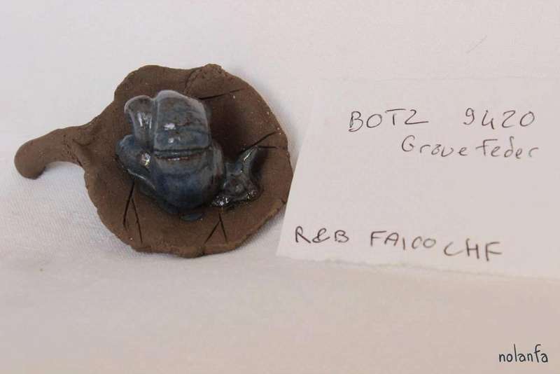
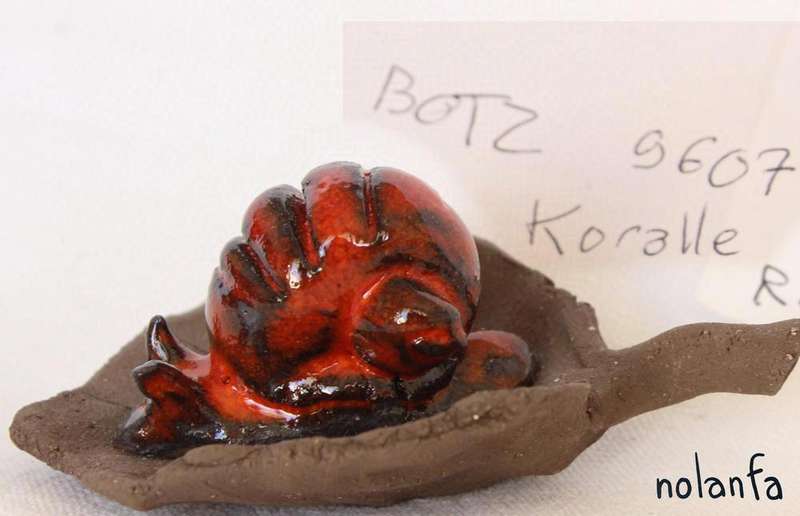
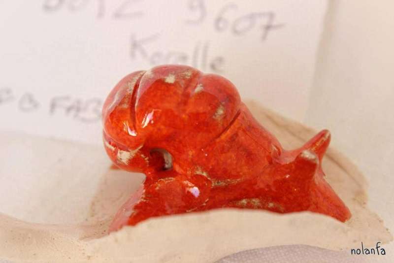
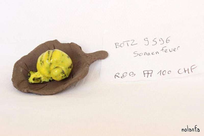
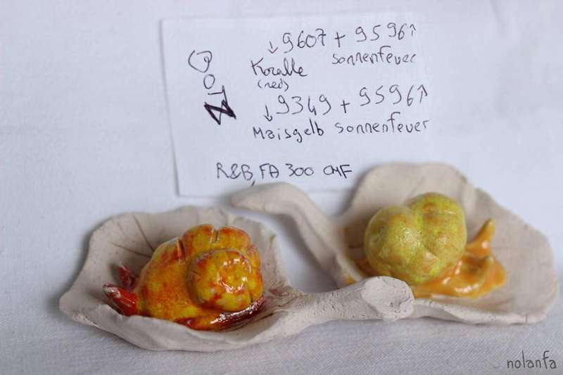
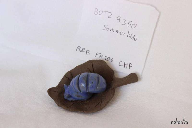
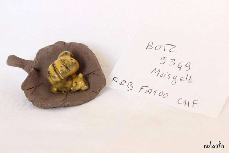
I use snails as samples to test out the behaviour of new glazes. The unglazed leaf will catch any stray drops and keep it from damaging the kiln.
So: a review of the last couple batches:
BOTZ glazes
My favorite BOTZ glaze is Graue Feder. It looks gorgeous wherever I put it, and it’s kind of just. Grey. I like that. I absolutely did not expect to love it that much.
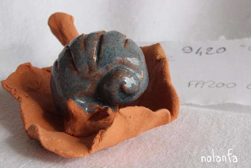
My second favorite is Koralle. It looks absolutely spectacular on black clay.
Sonnenfeuer is a bit disappointing. I expected a yellow Koralle, that is, a textured yellow (not textured as in the surface would be textured to the touch, but textured as in a color that is actually composed of several different ones). Instead it’s a mostly flat fluorescent yellow. But! Overlaid on top of Koralle it’s good.
Weirdly, over another yellow glaze it bubbled? My black clay has manganese and that has made several glaze samples bubble but this one test was over white clay.
and then there are the flat glazes. They’re…. fine. Just flat. They’ll be very good for the medaillons, but I don’t think I’ll use them as is for sculptures. It’d be boring. Maybe layered? Or patterned. The test tile on their website had very pretty patterns.
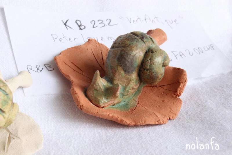
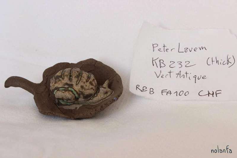
Peter Lavem
Vert Antique, from Peter Lavem, is my other favorite glaze when on red clay. It makes me think of oxidized copper and old things lost deep at sea.
On white clay, though, it is deeply disappointing, and on black it is flat-out ugly.
(maybe it will turn out it is pretty on white if applied thicker, but those are my feelings about how the current batches turned out. I will do more tests and update my impressions if necessary)
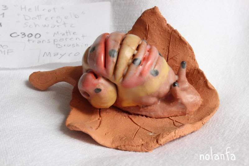
Mayco
I love when glazes have a different color depending on thickness. Not just the translucent ones that let the color of the clay through, but the opaque ones that actually change color when they pool in. Some of the glazes I bought from Mayco’s Elements series do that.

I also bought a transparent matte glaze. Turns out it’s not transparent it’s very milky and I hate it, but it gave me something very pretty over grey and blue glazes. I’ll do some more tests to try to replicate it in a way that doesn’t show the matte one around it (trying without the matte, was, sadly, a failure).
Whatever weird thing is going on with the islets
I also have translucent blue and green crackled glazes that look crazy good when applied thickly.
They sweat powdered glaze over time, though. I think I could fix that by firing them again, probably a bit higher.
Okay that’s all
That was all!
You can ask me if you’d like the specific references of the glazes I used, if it’s not legible on the picture itself. Or if you have ideas of glaze combinations you’d like me to try and post (using the glazes I already have). Or if you use a glaze you think I’d like (I’m only using low-fire glazes for now). Or if you have any questions. Or anything.